

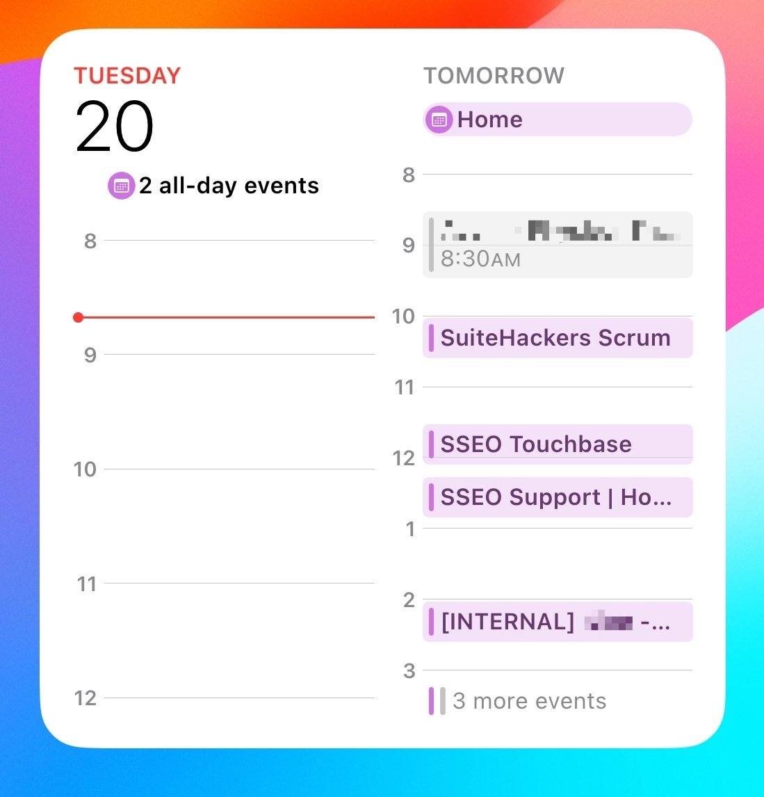
The most useless calendar widget is made by Apple. I constantly forget that someone’s birthday or something important is coming up later in the week.
Now I understand that you can set up alerts and you can set up reminders for stuff. I also understand that you can choose a different size widget. But depending on the size and the amount of events it’s possible it won’t even show you what’s going on the next day in the larger widget as well.
This is forced me to use third-party widgets to display calendar events for the week on my home screen. I hate it because I have no idea if it’s stealing my data.
Bonus Edit! The large widget fails to show you what’s happening today!

You must log in or # to comment.
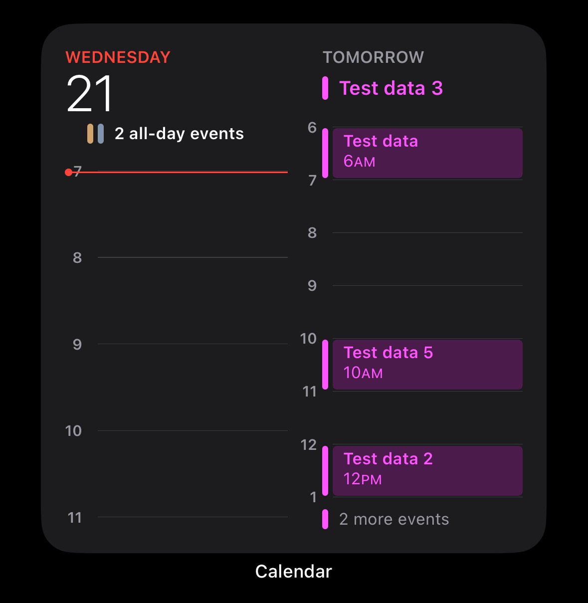
I agree. Luckily the iOS 18 one is a little better.
It still looks terrible IMO.
Edit:
I agree. Luckily the iOS 18 one is a little better.
It’s not differentl. It’s the same as iOS17.
Why it’s terrible.
- What are the “2 all-day events”?
- Why is HALF of the widget wasted white space.
- why are there 3 more events if half of the widget is wasted white space.
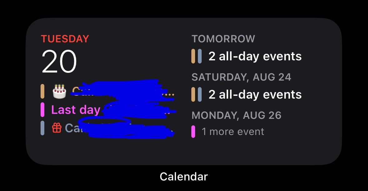
Edit: I’m familiar with the widget. I don’t need someone explaining to me how to click on a widget. I get it. I also understand it’s different than the one I posted. It’s called “Up Next”.
Despite which one you pick, they’re all poorly designed. It takes up a third of the screen and does a bad job at presenting as much information as possible within reason.
Edit 2: That specific calendar widget you posted from ios18 beta looks exactly the same as it does in ios17. This thread is pointless.
