

10·
2 days agodeleted by creator
deleted by creator
deleted by creator

And has been since 2016-17 ish. I’ve used these solutions. They ran Ubuntu.
It still looks terrible IMO.
Edit:
I agree. Luckily the iOS 18 one is a little better.
It’s not differentl. It’s the same as iOS17.
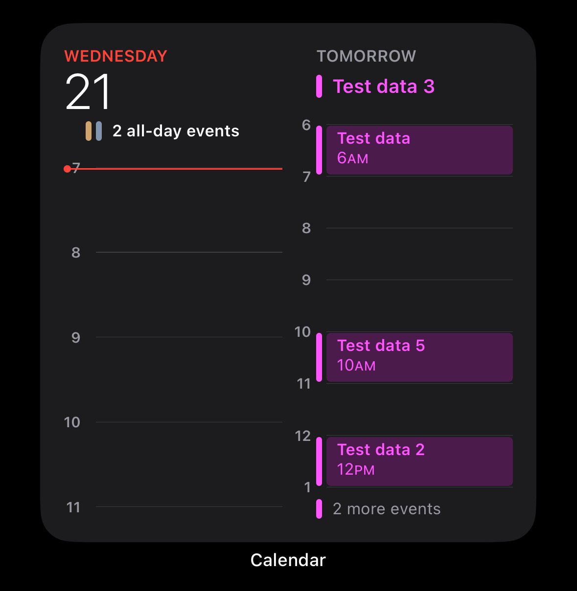
Why it’s terrible.
Edit: I’m familiar with the widget. I don’t need someone explaining to me how to click on a widget. I get it. I also understand it’s different than the one I posted. It’s called “Up Next”.
Despite which one you pick, they’re all poorly designed. It takes up a third of the screen and does a bad job at presenting as much information as possible within reason.
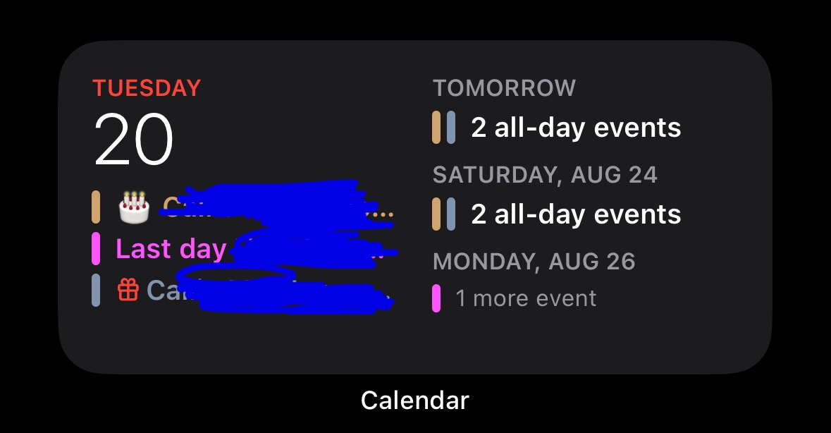
Edit 2: That specific calendar widget you posted from ios18 beta looks exactly the same as it does in ios17. This thread is pointless.

that’s never been an issue